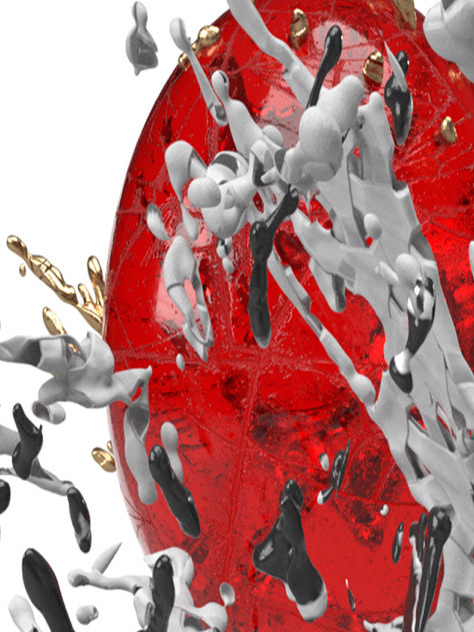
In my life, I loved seeing things and wondering why that way, and if need be, how to change things that don't make sense. In 2017, the State of Nebraska flew their flag upside down to show that no one would notice, and alas, no one did.
Since then, I looked to redesign the Nebraska State flag, and in so doing, I found a talent for redesigning things flags to serve a better representation of the people it stands in for.
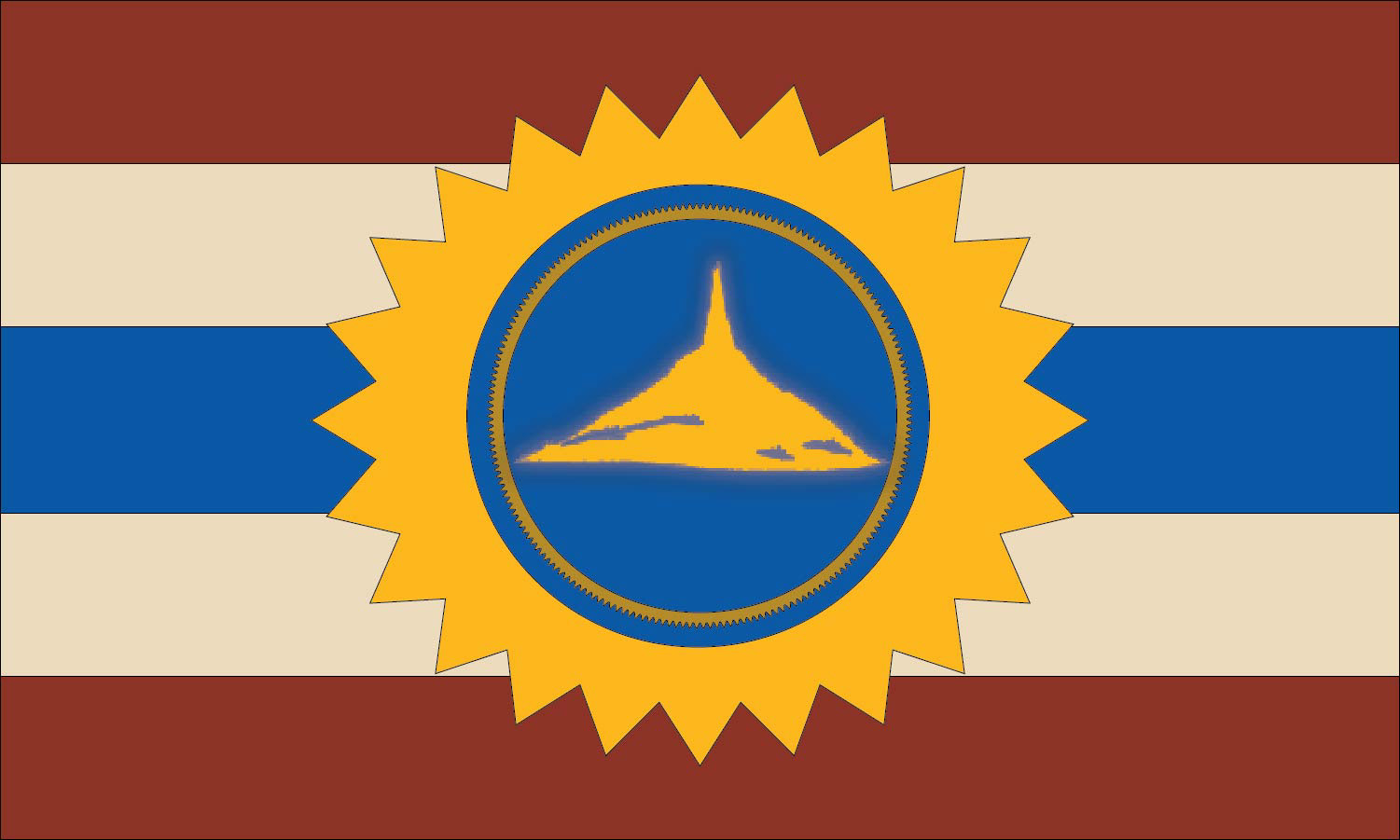
This is my current draft for the Nebraska State Flag Redesign.
Earth Lodge Maroon honors the Pawnee Nation and the earth lodges they built along Nebraska's rivers, with red standing for courage.
Indiana Limestone is the stone of the Nebraska State Capitol.
The blue center stripe is the Platte River, running through the heart of the flag the same way it runs through the heart of the state.
The gold sunburst comes from the mosaic in the Capitol rotunda.
Chimney Rock sits at the center: the Oregon Trail landmark that marked the way west for thousands of pioneers and still stands as a symbol of the state's grit.

Kansas State Flag Redesign (Concept)
Kansas has to write its own name on its flag so people can tell it apart from the other states. If a flag needs a label, it isn't doing its job.
So instead of starting over, I remodeled what was already there. Kansas already has an official state banner with a gold sunflower on a blue field, so every piece of this design is recycled from symbols the state already uses:
The blue field comes straight from the official state banner, keeping continuity with what Kansans already know.
The sunflower is the state flower and the heart of Kansas's identity. It has 34 petals because Kansas was the 34th state, and 34 also happens to be a Fibonacci number, just like the spirals in a real sunflower.
The compass rose at the center marks the geographic center of the contiguous United States, which sits in Smith County, Kansas. It points in every direction from the heart of the country, and it carries the state motto, Ad Astra per Aspera: to the stars through difficulties.
The long south point honors the Kansa, the "People of the South Wind," who gave the state its name. Like a weathervane, it points toward where the south wind comes from.
The white of the star is a nod to the silver stars on the state seal.
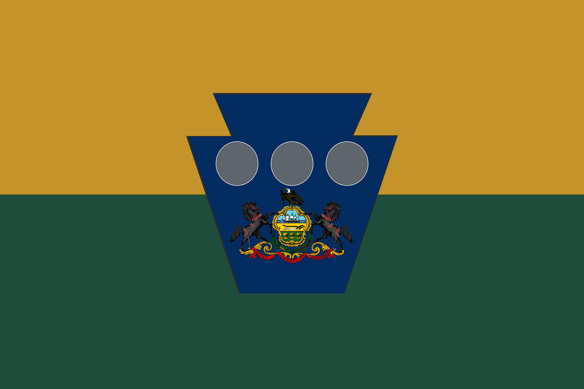
Pennsylvania's current flag is the state coat of arms on a blue field, which puts it in the same "seal on a bedsheet" club as most state flags. For a state with this much history, I wanted something that looked like Pennsylvania from across a parking lot.
Every part of this flag is rooted in the state's story:
Gold comes from Pennsylvania's traditional colors, blue and gold, already found on the current flag and the state's license plates.
Evergreen is Penn's Woods. "Pennsylvania" literally means Penn's Woods, and much of the state is still forest today.
The keystone sits at the center of the flag, just as Pennsylvania sat at the center of the original thirteen colonies, holding north and south together. It's also a shape Pennsylvanians see every day on their road signs.
The three silver circles come from William Penn's family coat of arms, a nod to the founder and his "Holy Experiment" in religious freedom.
The state coat of arms stays at the heart of the keystone to honor the Commonwealth's identity and its motto: Virtue, Liberty, and Independence.
This one took a lot of versions. I tried reds, dark blues, and grays before landing on gold and evergreen, and each round pushed me to make sure every color had a real reason to be there, not just a good look.
If you'd like, you can add the three rivers as a second meaning for the circles (the Allegheny and Monongahela meeting to form the Ohio at Pittsburgh). And that last paragraph about the process is worth keeping: hiring managers like seeing how you got to the final design, not just the final design itself.